OVERVIEW
Crypto Data Dive - Week 44

Welcome to the Crypto Data Dive for Week 44 of 2025!
In this issue, we'll dive into the data to keep you informed about the progress of the overall crypto market and shine a spotlight on emerging and established trends.
What You’ll Find In The Crypto Data Dive has three main objectives:
- Total and Altcoin caps, stamped with YTD moves and the gap to ATH.
- Seven-layer market-cap recap (TMC ex-stables, ex-top-50, and five more flavors).
- Crypto Index Performance covering 12 indices.
- The Liquidation Station boards the train with 30-day totals plus a 7-day heatmap for maximum schadenfreude.
- Market Heatmap, Social Volume Heatmap, Active Address Heatmap.
- ETF scorecards for BTC and ETH still tracking 7- and 30-day flows.
So, without further delay, let's jump right into the data from week 44 and explore its intriguing insights!
CRYPTO
Crypto Market Cap Update
What is the broader trend within the crypto market? The simplest way to track this is by using three market cap charts. So let's see what we got.
*the price levels and performance values may be very different from what you read in your mailbox vs. what's happening in the live market. This is especially true when crypto faces a new bull or bear run.
Total Market Cap
- All-Time High Close: $4.22 trillion
- YTD: +12%
- From ATH: -15%
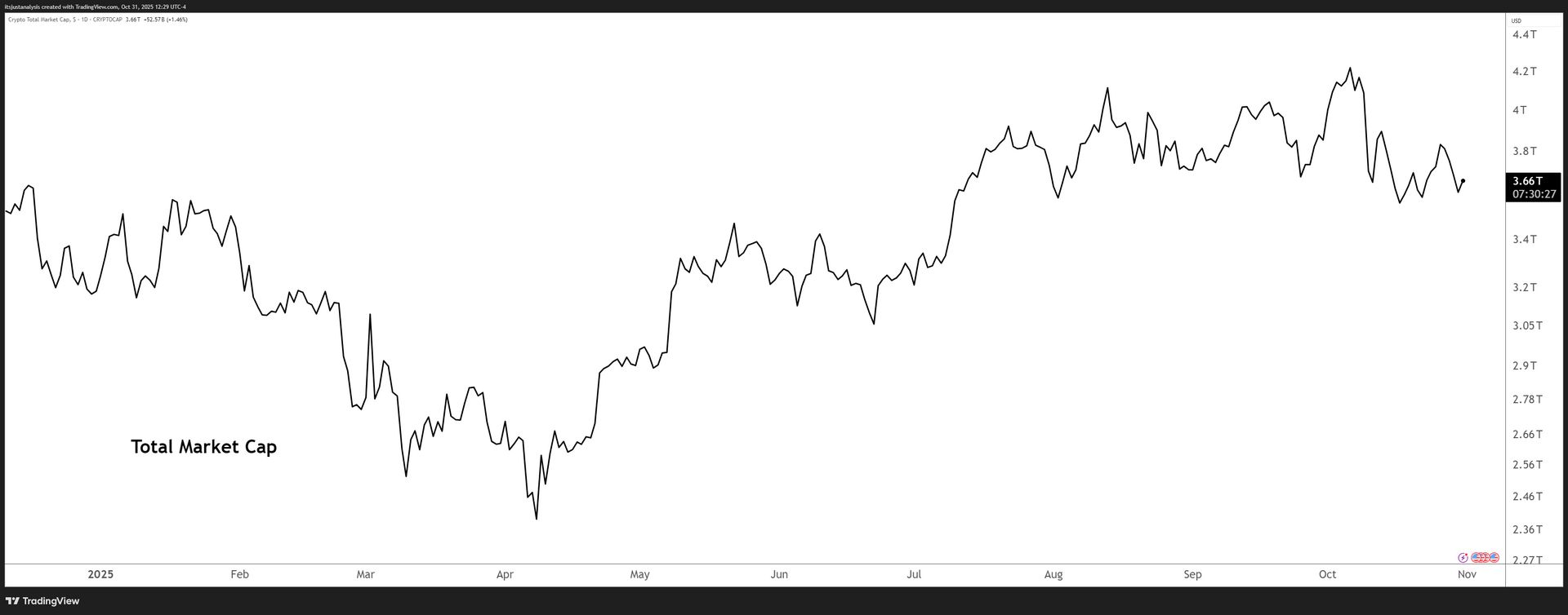
Click to enlarge.
Altcoin Market Cap
- All-Time High: $1.73 trillion
- YTD: +2%
- From ATH: -15%
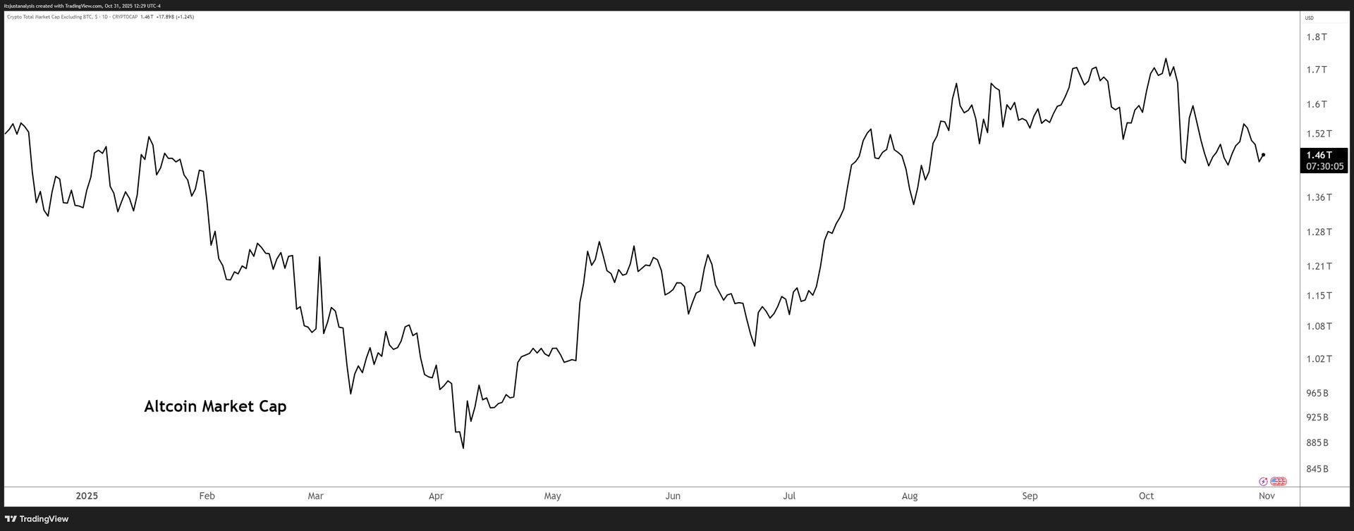
Click to enlarge.
CRYPTO
Crypto Index RRG
Relative Rotation Graphs (RRG) help us visualize how a currency or sector performs compared to a benchmark - in this case, the U.S. Dollar Index (DXY). Think of the four colored sectors as stages in a race:
- Leading Quadrant (green) - You're a champ! 🏆 You're ahead of everyone else, and the crowd is cheering. But watch out; you might be overdoing it.
- Weakening Quadrant (yellow) - You're slowing down 😓 and losing your lead. Maybe you're a bit demoralized because your biggest fan didn't show up. You're now in the middle of the pack.
- Lagging Quadrant (red) - Disaster strikes! 😱 You're injured, exhausted, or just made a big mistake. You're now in last place, and it's a sad scene.
- Improving Quadrant (blue) - Time for a comeback! 💪 Your motivation returns, the music swells, and you're picking up speed. You're back in the middle, catching up with the leaders.
Analyzing the RRG Examples
Example 1: Rapid Rotation
- If an instrument moves quickly through all four quadrants, it could indicate high volatility or erratic behavior. Traders may want to be cautious or use appropriate risk management strategies in such cases.
Example 2: Stuck in the Middle
- An instrument that remains close to the center of the RRG might be in a consolidation phase, lacking a clear trend or momentum. Traders might wait for a decisive move before entering a position.
Example 3: Consistent Leader
- If an instrument stays in the Leading Quadrant (top right) for an extended period, it could signify a strong, sustained uptrend. Traders might consider buying opportunities or riding the trend.
Example 4: Slow Recovery
- An instrument that gradually moves from the Lagging Quadrant (bottom left) to the Improving Quadrant (blue) and eventually to the Leading Quadrant (green) could indicate a slow but steady recovery. Traders might look for potential reversal or bottom-fishing opportunities.
The GIF below shows the past 21 days of movement on the RRG.
 Click to enlarge.
The GIF below shows the past 13 weeks of movement on the RRG.
 Click to enlarge.
CRYPTO
Total Market Cap (TMC) Performance For 2025
| Index | Value | Weekly Performance |
| TMC Excluding BTC and ETH | $1T | -2% |
| TMC Excluding BTC and Stablecoins | $1.19T | -2% |
| TMC Excluding BTC, ETH, and Stablecoins | $708B | -2% |
| TMC Excluding Stablecoins | $3.34T | -4% |
| TMC Excluding Top 10 | $247B | -1% |
| TMC Excluding Top 50 | $58B | -2% |
| TMC Excluding Top 100 | $11B | -4% |
CRYPTO
Crypto Index Performance For 2025
| Index | Weekly Performance |
| AI | -5% |
| Decentralized Finance | -1% |
| Decentralized Physical Infrastructure | -1% |
| Exchange Tokens | -1% |
| Layer 1 | +1% |
| Meme | +2% |
| Proof-Of-Stake | -1% |
| Proof-Of-Work | +1% |
| Real World Asset Tokenization | -3% |
| Rehypothecated | -1% |
| Smart Contracts | -1% |
| Stablecoins | +1% |
CRYPTO
Liquidation Station
Interested in how much has been flushed out of leveraged long and short positions? Who’s getting hurt the most? This is the best place to get an idea of how leveraged positions are doing.
30-day Total Liquidations
What You’re Looking At
- Green bars above zero = longs blown out because price fell.
- Red bars below zero = shorts blown out because price ripped.
- Left-hand scale is U.S. dollars (millions); the dashed line near the top sits at $1B.
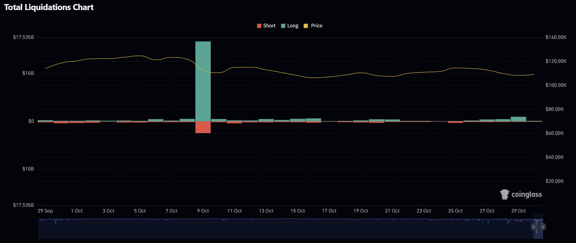
30-day Total Crypto Liquidation Chart - Click to enlarge.
- Oct 9 - the month’s meteor: $12-14B long wipe in a single day. That’s the cascade.
- Oct 15-16 - small alternating prints ($100-200M) as price slid and shorts nibbled.
- Oct 21-23 - tiny, even bars; market re-leveraging.
- Oct 27-29 - modest green run building toward $150-300M/day; Oct 29 is the week’s biggest non-event bar.
- Oct 30 - small red follow-through as shorts try to fade the bounce.
7-day Liquidation Heat Map
What You’re Looking At
- Rows = coins, columns = timestamps.
- Color = head-count of forced liquidations (legend tops at 2,000).
- A cell showing “BTC 1,600” means 1,600 separate BTC positions were liquidated.
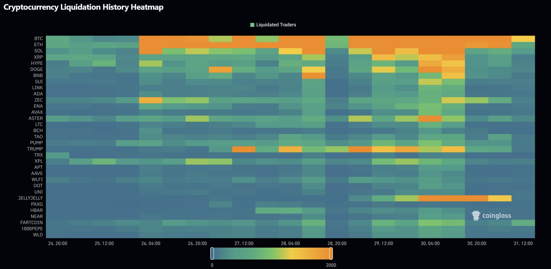
7-day Cryptocurrency Liquidation Heatmap - Click to enlarge.
- Oct 26-27 - BTC/ETH rows run yellow → orange repeatedly; SOL and XRP echo one tier cooler 1-3 hours later.
- Oct 28 - broad warm zone across majors during U.S. hours; alts light up in sequence.
- Oct 30 - rotation: ETH hotter than BTC; LINK and ZEC show scattered yellow pops.
- Oddities - TRUMP and JELLYJELLYprint sustained orange bands (product-specific flow, not market-wide).
Some Interesting Insights
- Oct 9 still runs the show. That single $12-14B long purge dwarfs everything else on the monthly.
- This week = rebuild and probe.Heatmap shows multiple BTC/ETH yellow→orange stretches as traders re-arm; the 30-day bars add modest green prints into Oct 29.
- Rotation mattered. ETH led several heat spikes; majors lit first, alts followed-same playbook.
- Operational rule that keeps paying: any day > $600Mliquidated or any hour > 1,500head-count tends to be followed by a sharp counter-move inside 24-48 hours. Size accordingly.
HEATMAP
One-Week Crypto Heat Map
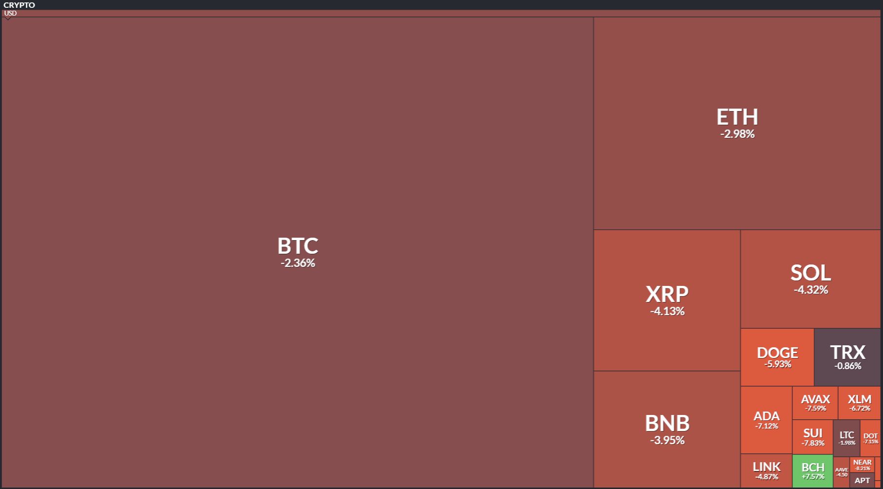
Click to enlarge.
One-Month Crypto Heat Map
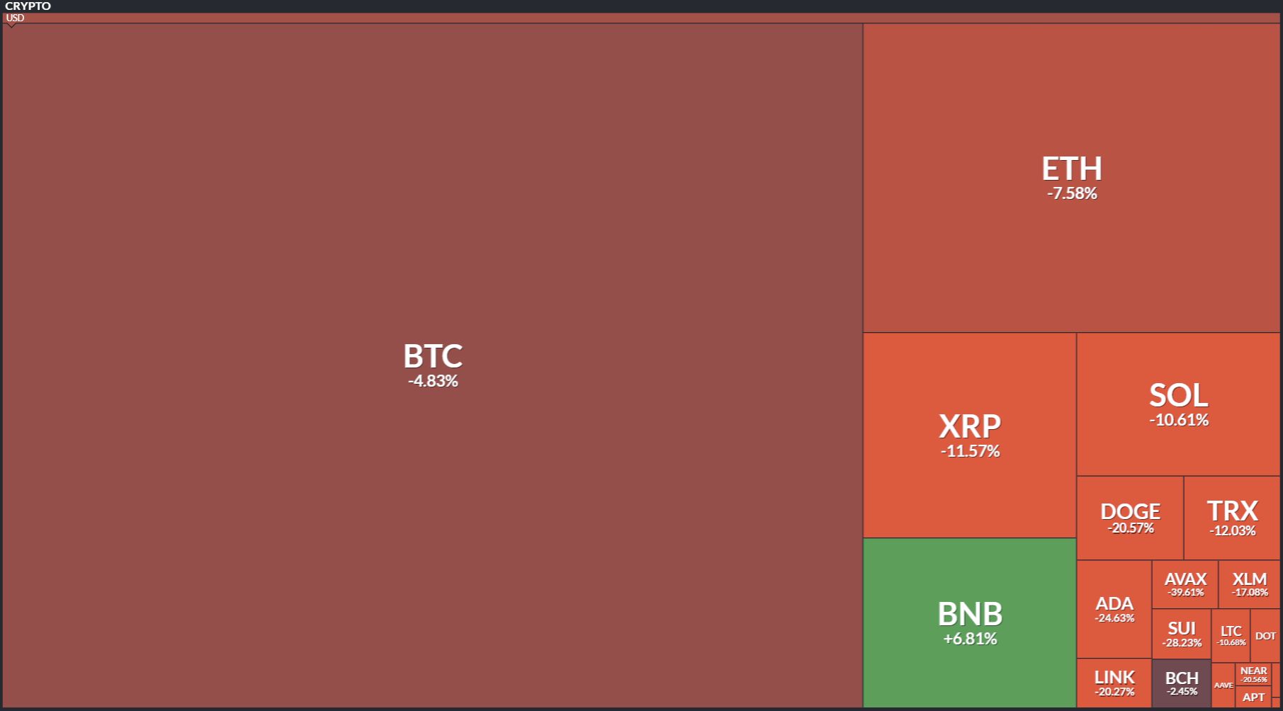
Click to enlarge.
Quarterly Crypto Heat Map
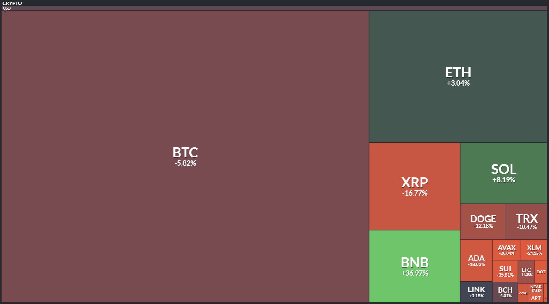
Click to enlarge.
YTD Heat Map
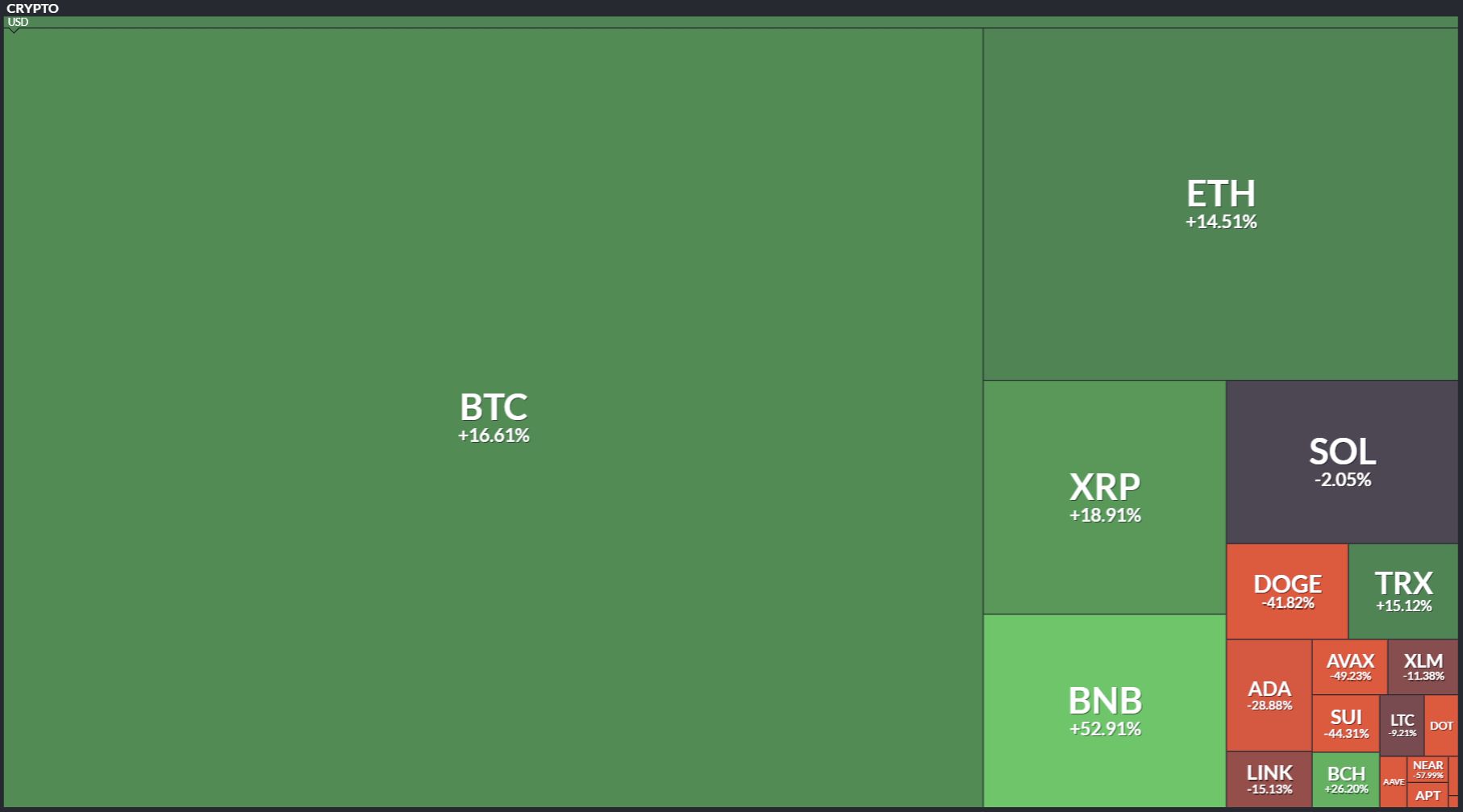
Click to enlarge.